웹 개발에 유용한 피그마 플러그인 알아보기
피그마(Figma)는 협업을 위한 클라우드 기반 디자인 툴로, 디자인, 프로토타이핑, 피드백 공유 등의 기능을 제공한다. 사이드 프로젝트, 회사에서 웹 개발을 할 때 항상 피그마로 화면을 받아 개발했는데 피그마 플러그인을 효과적으로 써본 적은 없는 것 같다. 그래서 이번 기회에 어떤 피그마 플러그인들이 있고 어떻게 피그마 플러그인을 만들 수 있는지 알아보겠다.
피그마 플러그인은 피그마의 기능을 확장하거나 사용자의 작업 효율을 향상시키는 추가 도구입니다.
플러그인 for Dev
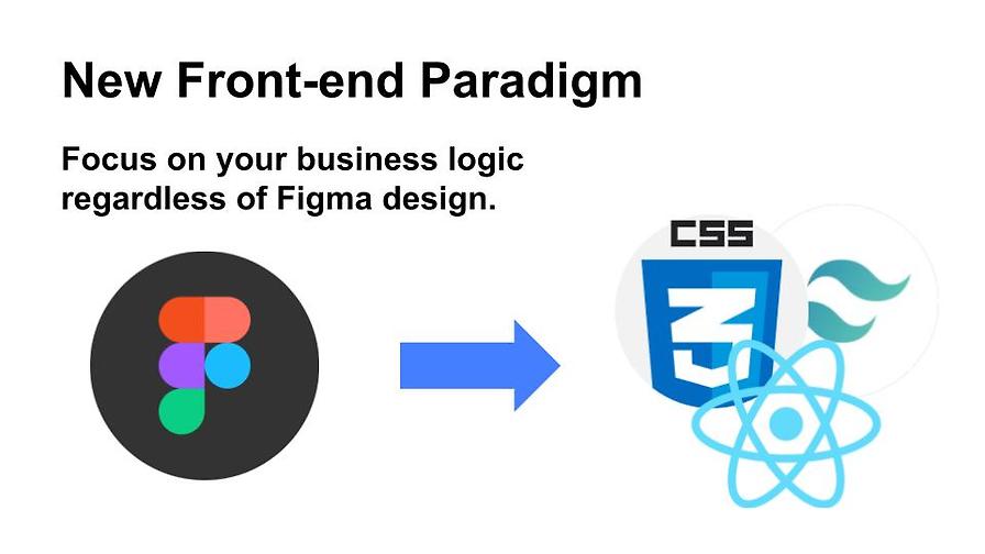
#다양한 목적을 가진 수많은 플러그인이 있다. 이번 포스팅에서는 디자인을 리액트 컴포넌트로 변환시키는 플러그인의 종류와 사용법에 대해 소개하겠다.
10,000+ Free Software Development Plugins & Tools | Figma
Discover free developer-friendly plugins and tools for efficient software development

24년 3월 5일 기준, TOP 4는 위와 같다. html.to.design은 웹사이트를 피그마 디자인으로 변환하는 플러그인이라 이번 소개에서는 제외한다.
Figma to Code
#Efficiently convert Figma layouts into responsive webpages (HTML or Tailwind) or mobile applications (Flutter or SwiftUI) while maintaining the integrity of your original designs.
피그마 디자인을 HTML, Tailwind, Flutter, SwiftUI 코드로 변경해주는 플러그인이다. 반응형 디자인도 지원한다. (Auto Layout 적용 필요)
위 링크를 접속해서 아래 사진과 같이 Plugins 탭에서 Figma to Code Run를 클릭하면 된다.

Run를 클릭하고 특정 컴포넌트를 선택하면 아래 화면과 같이 컴포넌트에 대한 코드를 보여준다.


디자인에 대한 반응형 미리보기를 제공해 주고 플랫폼별 코드를 제공한다.
Anima
#사용법은 위 플러그인과 동일해서 생략한다. anima는 리액트 컴포넌트 자체를 만들어준다.

피그마에서 컴포넌트로 디자인하고 컴포넌트에 대한 Property를 정의해주면 anima는 만들어질 컴포넌트의 props 와 state 까지 코드로 만들어준다.

자동 생성된 코드
/*
We're constantly improving the code you see.
Please share your feedback here: https://form.asana.com/?k=uvp-HPgd3_hyoXRBw1IcNg&d=1152665201300829
*/

import React from "react";
import { useReducer } from "react";
import { Icon2 } from "../../icons/Icon2";

interface Props {
  showIcon: boolean;
  text: string;
  stateProp: "disabled" | "hover" | "default";
  type: "primary" | "secondary";
}

export const PrimaryButton = ({ showIcon = true, text = "Get Started", stateProp, type }: Props): JSX.Element => {
  const [state, dispatch] = useReducer(reducer, {
    state: stateProp || "default",
    type: type || "primary",
  });

  return (
    <button
      className={`all-[unset] box-border inline-flex items-center gap-[8px] transition-all duration-[0.3s] ease-[ease] px-[20px] py-[12px] h-[40px] rounded-[8px] justify-center relative ${
        state.type === "secondary" ? "border border-solid" : ""
      } ${
        state.state === "default" && state.type === "secondary"
          ? "border-primary-color"
          : state.type === "secondary" && state.state === "hover"
          ? "border-secondary-color"
          : state.type === "secondary" && state.state === "disabled"
          ? "border-grey-1-color"
          : ""
      } ${
        state.type === "secondary"
          ? "bg-white-color"
          : state.type === "primary" && state.state === "hover"
          ? "bg-secondary-color"
          : state.type === "primary" && state.state === "disabled"
          ? "bg-grey-1-color"
          : "bg-primary-color"
      }`}
      onMouseLeave={() => {
        dispatch("mouse_leave");
      }}
      onMouseEnter={() => {
        dispatch("mouse_enter");
      }}
    >
      <div
        className={`[font-family:'Poppins',Helvetica] w-fit mt-[-5.00px] tracking-[0] text-[14px] font-semibold text-center whitespace-nowrap mb-[-3.00px] leading-[24.0px] relative ${
          state.state === "default" && state.type === "secondary"
            ? "text-primary-color"
            : state.type === "secondary" && state.state === "hover"
            ? "text-secondary-color"
            : state.type === "primary" && state.state === "disabled"
            ? "text-grey-2-color"
            : state.type === "secondary" && state.state === "disabled"
            ? "text-grey-1-color"
            : "text-white-color"
        }`}
      >
        {text}
      </div>
      {showIcon && (
        <Icon2
          className="!relative !w-[20px] !h-[20px] !mt-[-2.00px] !mb-[-2.00px]"
          color={
            state.state === "default" && state.type === "secondary"
              ? "#009379"
              : state.type === "secondary" && state.state === "hover"
              ? "#016D5A"
              : state.state === "disabled"
              ? "#868686"
              : "white"
          }
        />
      )}
    </button>
  );
};

function reducer(state: any, action: any) {
  switch (action) {
    case "mouse_enter":
      return {
        ...state,
        state: "hover",
      };

    case "mouse_leave":
      return {
        ...state,
        state: "default",
      };
  }

  return state;
}
builder.io
#
builder.io도 사용법은 마찬가지이다. 위 사진 오른쪽 Generate Code를 클릭하면 아래와 같은 사이트로 이동한다.

자동 생성된 코드
import * as React from "react";

function MyComponent() {
  return (
    <div className="flex gap-2 justify-center px-5 py-2 text-sm font-semibold leading-6 text-center text-white whitespace-nowrap bg-emerald-700 rounded-lg">
      <div className="grow">Get Started</div>
      <img
        loading="lazy"
        src="https://cdn.builder.io/api/v1/image/assets/TEMP/a3fbe8e72383b784d2cb69794bda3110e5b843afd75431d517fc25dee8d9ae00?"
        className="shrink-0 my-auto w-5 aspect-square"
      />
    </div>
  );
}
정리
#3개의 플러그인 모두 AI를 기반으로 자동으로 코드를 생성해준다.
Figma to Code
Figma to Code는 HTML, Tailwind, Flutter, SwiftUI 에 대한 코드를 생성할 수 있다. 다만, 컴포넌트 디자인에 정의된 property에 대한 코드는 생성하지 못한다.
Anima
React(Tailwind, CSS), Vue(Beta), HTML 에 대한 코드를 생성할 수 있다. MarkUp 뿐만 아니라 정의된 property에 대한 코드도 생성한다.
builder.io
React, Qwik, Vue, Svelte, RN, Angular, HTML, Solid 에 대한 코드를 생성할 수 있다. 리액트로 생성하면 리액트 컴포넌트를 만들어주지만 피그마의 컴포넌트 디자인에 정의된 property를 코드로 생성하지 못한다.
builder.io 플러그인은 디자인 툴(framer, figma 등)인 builder.io에서 만든 플러그인이다.
builder.io 사이트에서 아래와 같이 우리가 직접 만든 커스텀 컴포넌트를 추가하면 컴포넌트의 property가 추가되고 컴포넌트 재사용 할 수 있어 보인다. (24년 3월 13일에 기능이 추가될 예정)


직접 사용해 봐야 알겠지만, 피그마에서 디자인된 컴포넌트를 builder.io 에 추가하고 builder.io 플러그인을 사용해서 코드를 생성하기에는 builder.io 에 대한 dependency가 너무 생기는 게 아닌가 하는 생각이 든다…
그렇다면 디자인에서 코드를 생성할 때 디자인 시스템에 정의된 컴포넌트는 해당 컴포넌트를 가져다 만들고 디자인 시스템에 정의된 컴포넌트가 아닌 경우는 AI가 직접 코드를 만들어주는 경우는 플러그인은 없을까?
아쉽지만 아직은 그 정도 수준의 기능이 public 하게 열려있는 경우는 없는 것 같다 ㅠ
디자인 시스템에서 정의된 디자인 토큰(Typography, Color 등)도 마찬가지로 토큰을 가져다 코드로 생성해 주는 플러그인도 아직 없는 것 같다..
그렇다면 디자인 시스템으로 정의된 컴포넌트를 코드로 우아하게 변환해서 사용하려면 어떻게 해야할까?
간단하게 정리해서 Figma Design(with Design System) → Code로 사용할 수 있는 방법은 아래와 같을 것이다.
- 디자인이 Auto Layout으로 되어있다.
- 디자인 시스템에 정의된 컴포넌트가 있고 해당 컴포넌트의 property가 잘 정의되어 있다.
- 피그마 플러그인을 직접 만들어서 피그마 디자인을 코드로 변환한다.
플러그인 만들어 보기
#말은 쉽지만 플러그인을 직접 만들어서 피그마 디자인을 코드로 변환하는 것은 시간과 노력이 엄청나게 필요할 것이다.
이번 포스팅에서는 대략 어떤 방식으로 플러그인을 만들 수 있는 지 맛만 보도록 하겠다.


피그마 앱에서 New plugin을 클릭해 플러그인 이름을 입력하고 Code generator를 선택한다.

저장한 후 파일 경로를 선택하면 해당 경로에 위와 같은 코드들이 생성되어 있는 것을 확인할 수 있다. 터미널에서 아래 명령어로 로컬에서 생성한 플러그인을 실행할 수 있다.
yarn
yarn watch

Plugins → Development → Manage plugins in development 클릭하면 내가 생성한 플러그인이 등록되어 있는 것을 확인할 수 있다.


오른쪽 사진의 binary figma Test 패널을 보면 아래와 같이 생성되어 있는 것을 확인할 수 있는데, 이는 왼쪽 사진의 return 구문에 해당하는 것을 알 수 있다.
{
	name: "버튼명"
}
그럼 간단하게 피그마 디자인으로 정의된 CSS를 디자인 토큰으로 변환하는 플러그인을 만들어보자!

첫번째로, 작업을 하다 보면 디버깅이 어려운데 위처럼 Show console 옵션을 켜서 브라우저 콘솔 로그로 디버깅해보자!
// code.ts

figma.codegen.on('generate', async (event) => {
  const code = `{
    name: "${event.node.name}"
  }`;
  if(event.node.type === "INSTANCE"){
   console.log(await event.node.getMainComponentAsync());
   console.log(await event.node.getCSSAsync());
  }
  return [
    {
      language: "PLAINTEXT",
      code: code,
      title: "binary figma Test",
    },
  ];
});
위처럼 코드를 작성하고 피그마에 디자인된 컴포넌트를 클릭하면 아래와 같은 정보를 확인할 수 있다.


피그마에 디자인된 컴포넌트는 InstanceNode 와 매칭되는 것을 아래 링크에서 확인할 수 있다.
InstanceNode | Developer Docs
Instances are a copy of a component (see ComponentNode). They will always be automatically updated if a component is modified. Instances can be created using the createInstance method on any component node.

예시의 디자인 컴포넌트에서 인스턴스 노드 하위에 Frame 노드 하위에 텍스트 노드가 위치해있다. 이 경우, children 하위로 접근해서 각 노드의 정보를 가져올 수 있다.
Instance의 background 를 가져와서 tailwind로 변환해보자!
// code.ts

...

  if (event.node.type === "INSTANCE") {
    const css = await event.node.getCSSAsync();
    const bg = css?.background;

    const match = bg.match(/var\(--(.*?),/);

    const variableName = match ? match[1] : null;

    const cssCode =
`{
  bg-tailwind: "bg-${variableName}"
}`;

    return [
      {
        language: "CSS",
        code: cssCode,
        title: "binary figma Test CSS",
      },
    ];
  }

...
type 이 INSTANCE 인 경우 해당 node의 CSS를 가져왔고 background 값을 정규표현식을 이용해 필요한 부분만 추출하고 tailwind로 변환해보았다.

그 결과, 위 사진처럼 직접 만든 플러그인에서 원하는 tailwind 디자인 토큰을 가져올 수 있다.
// code.ts

...

    const htmlCode = `<div className=bg-${variableName}>content</div>`;
    return [
      {
        language: "HTML",
        code: htmlCode,
        title: "binary figma Test CSS",
      },
    ];

...
위 코드로 변경하면 아래와 같이 MarkUp도 만들수 있다.

Reference
#Builder.io: Collaborative Platform to Build With AI Agents
One codebase for engineers, designers, PMs, and marketers. Everyone works from one source of truth, on brand and in code, with no handoffs to clean up.

OROR Forge: Figma to Code 도구 제작기 (1) 디자인을 코드로 만들어보자! - tech.kakao.com
프롤로그 안녕하세요, OROR 프론트엔드 팀의 테오입니다! 이번 글에서는 프론트엔...
techblog.woowahan.com
피그마 Dev mode 플러그인을 만들어서 웹 프론트엔드팀 생산성 높여보기
피그마에서 디자인 시스템 컴포넌트를 활용한 부분을 코드로 손쉽게 변환할 수 있는 피그마 플러그인을 개발해 생산성을 높인 배경과 방법을 소개합니다.